Skip to content
Case study · Wedding website

Kamila & Jakub, on paper and on screen.

Kamila and Jakub knew the world they wanted - the greenery and hydrangeas of their venue, a soft palette, something elegant and a little romantic. I turned it into their whole stationery suite, from the invitations to the signage on the day, and then built the part I love most: a bilingual website that feels like the same wedding, and like no one but them.

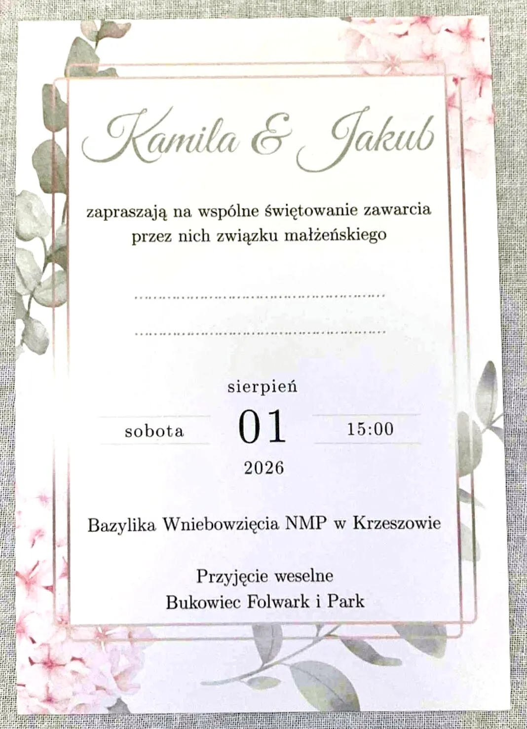
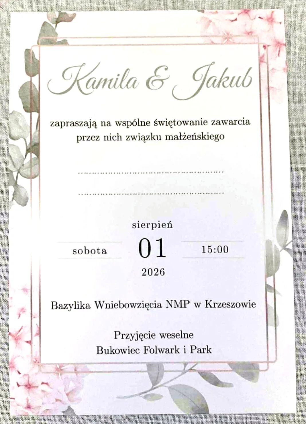
The printed Polish invitation
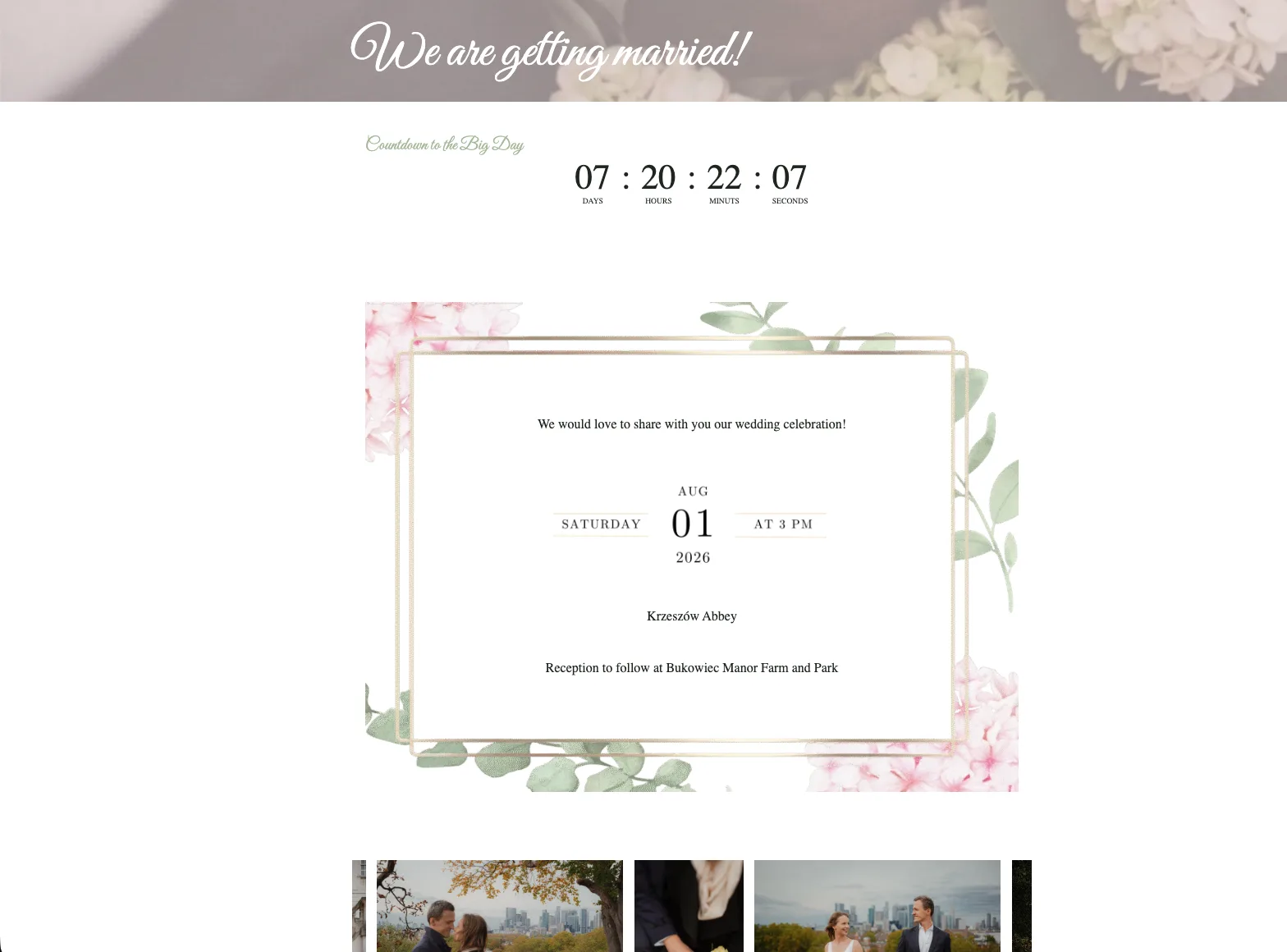
The wedding website's invitation block, in the same frame
The invitation and the website - the same frame, the same flowers, the same type.
The challenge

One wedding, from envelope to easel.

Most couples pour their love into beautiful stationery, then reach for a website builder and get a generic template that looks nothing like it - and the signage on the day is often a third style again. Kamila and Jakub's guests were coming from Poland, the UK and beyond, so everything had to work in two languages too. The goal was one continuous world: the same frame, flowers and type on the invitation in a guest's hand, on the site on their phone, and on the easels at the venue - with a website practical enough to handle a whole weekend of logistics.

What I made

One suite, one world.

01

The invitation suite

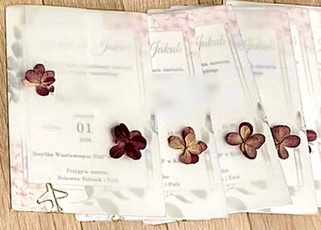
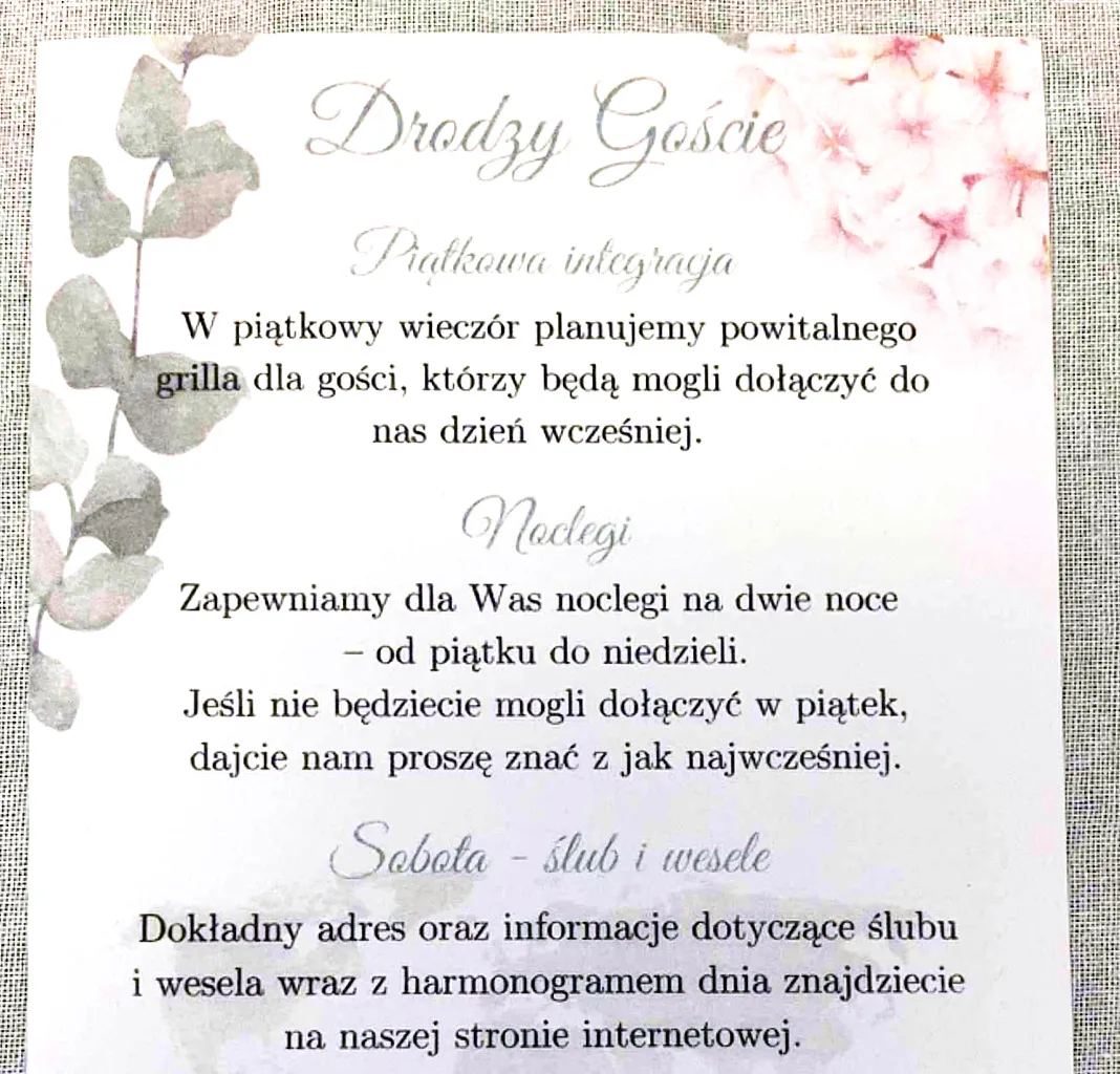
Invitations in Polish and English, wrapped in vellum and sealed with dried hydrangea, plus an info card with a QR code that opens the website.

02

Signage for the day

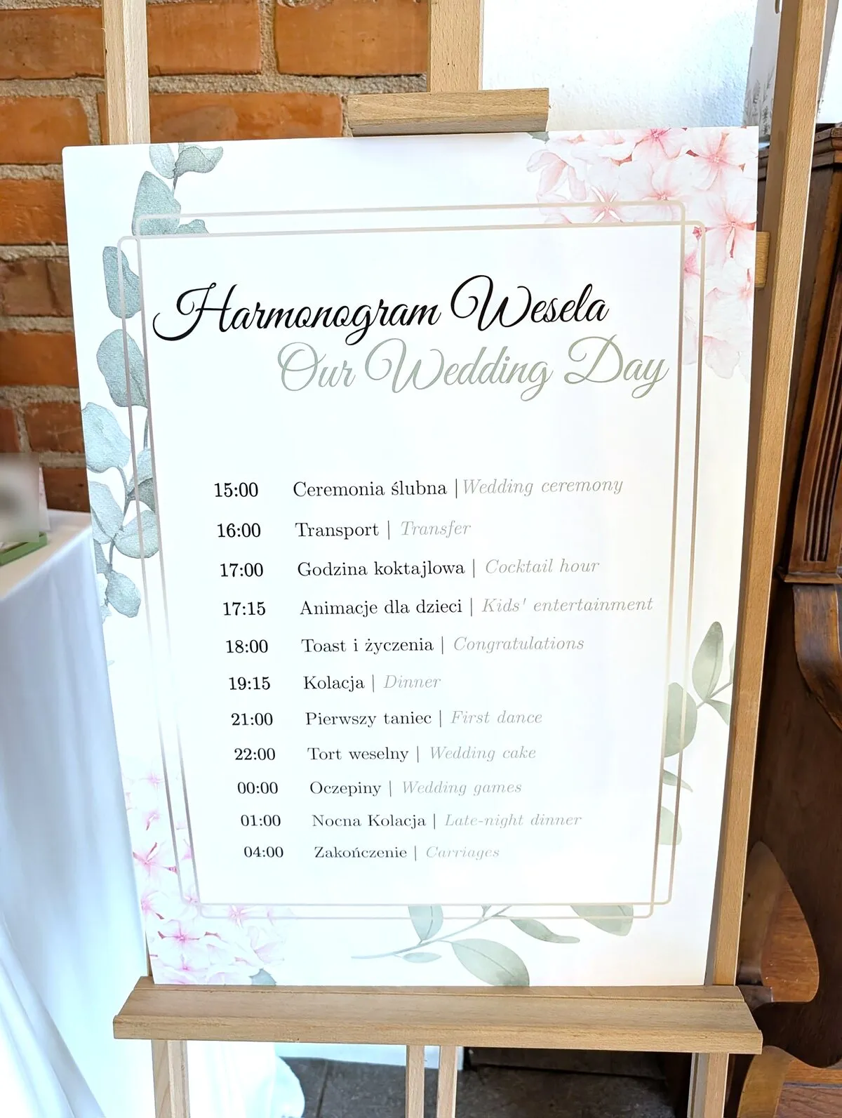
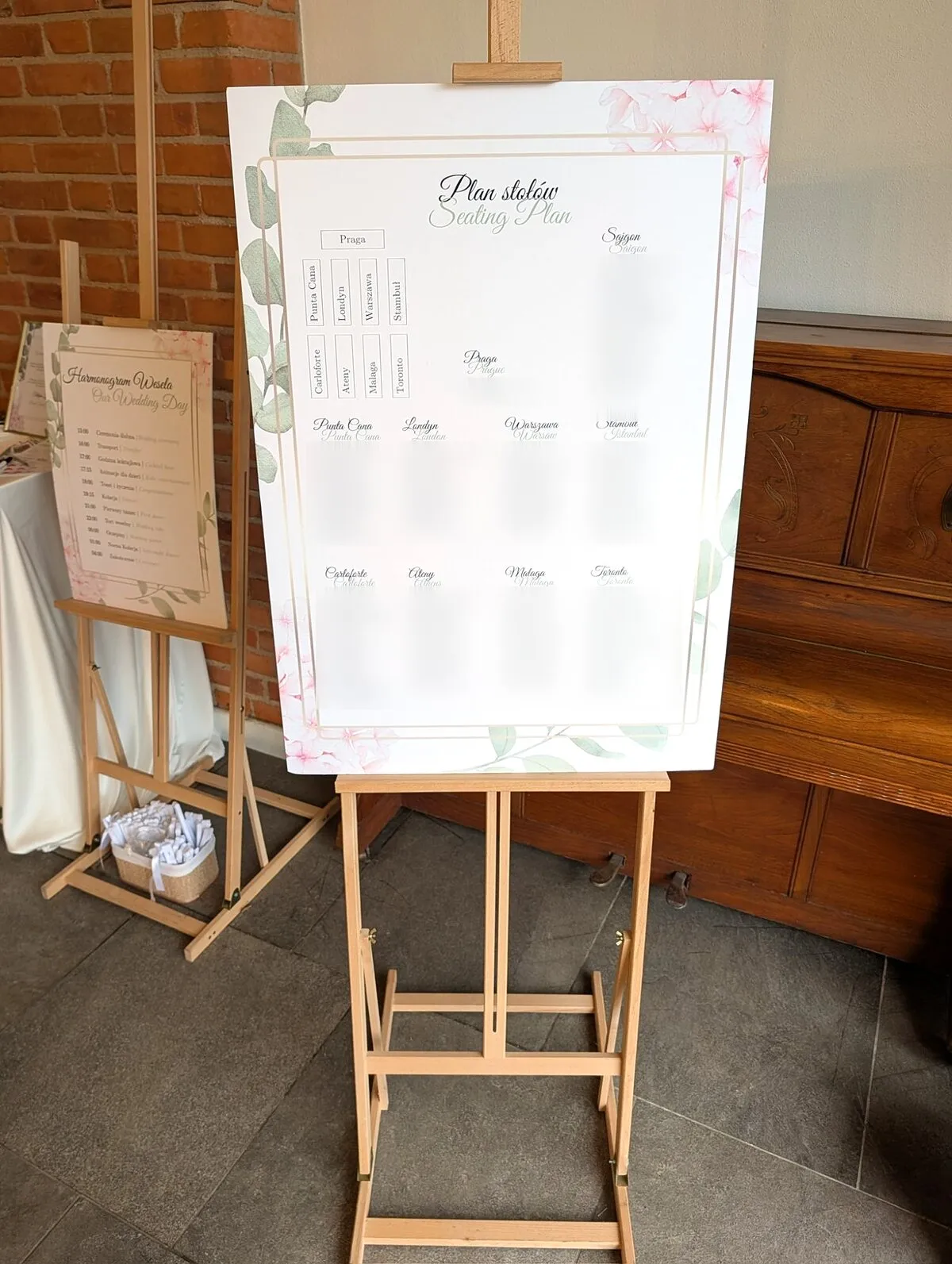
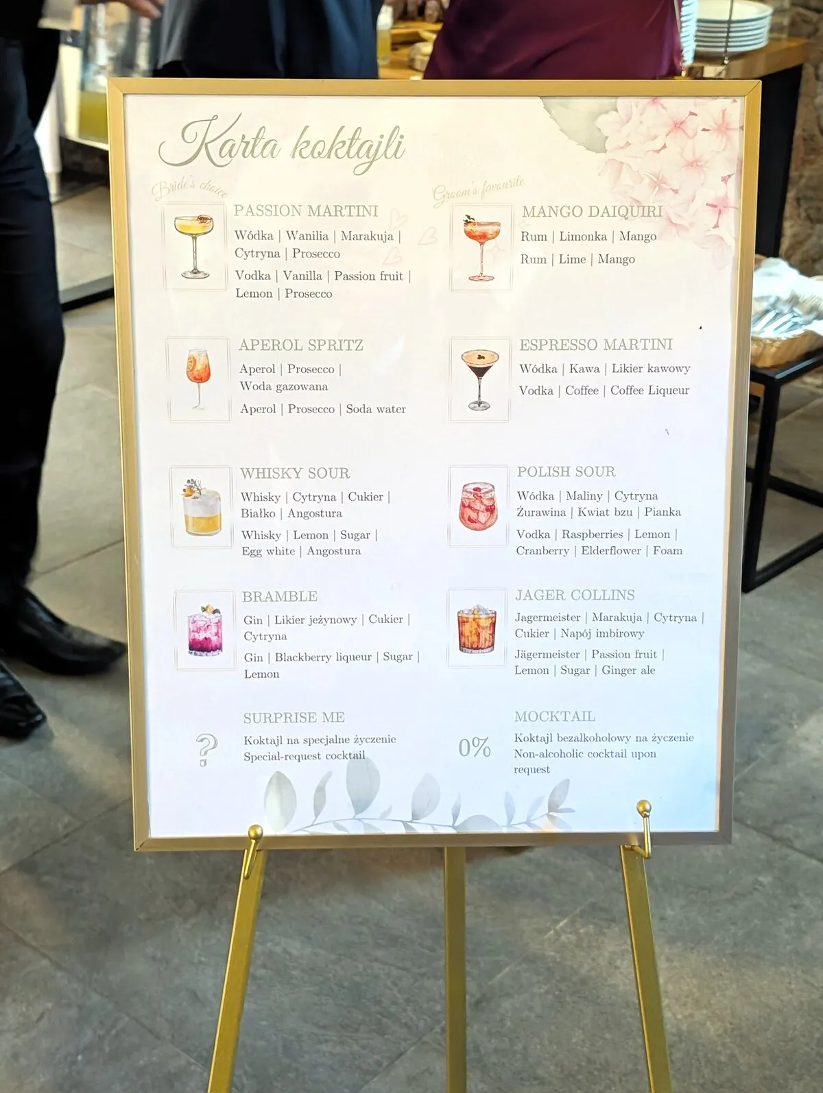
The schedule board, the seating plan and the cocktail menu - the same frame and flowers, carried all the way to the venue.

03

A website that matches

The invitation's frame, its typeface and its hydrangeas, rebuilt for the screen - so the site reads as the next page of the card.

04

A schedule inside the frame

The weekend's timeline scrolls inside the invitation's own frame, as if the guest were turning the card in their hands.

05

A conditional, private RSVP

A password-protected form that only asks what matters: 62 rules adapt it to each guest, their diet, their nights and up to five companions.

06

Two languages, one weekend

Every page and the RSVP in Polish and English - story, directions, rooms, dress code, wedding party and FAQ.

Try it

The schedule, inside the invitation.

On the website the weekend's schedule doesn't sit in a table - it lives inside the invitation's frame. As you scroll, the frame stays put and the timeline moves through it, fading in at the top and out at the bottom, so reading the plan feels like holding the card.

Below is the same effect, rebuilt here with the real frame artwork and the day's actual plan. Scroll through it.

Wedding Schedule

Friday, 31 July 2026

Welcome Day

  • 4 PMBBQ & drinks
  • 9 PMEnd of the evening

Saturday, 1 August 2026

The Wedding Day

  • 3 PMWedding ceremony
  • 4 PMTransfer
  • 5 PMCocktail hour
  • 5:15 PMKids' entertainment
  • 6 PMToast & congratulations
  • 7:15 PMDinner
  • 9 PMFirst dance
  • 10 PMWedding cake
  • 12 AMWedding games
  • 1 AMLate-night dinner
  • 4 AMCarriages
The invitation's frame, with hydrangeas and eucalyptus

The English version of the site's schedule. The frame is the invitation's own artwork.

Try it

An RSVP that asks only what matters.

The RSVP sits behind a guest password printed on the info card, so only invited guests see it. Everything after that adapts: decline, and the form simply thanks you; accept, and it asks about the Friday BBQ, your diet, transport and rooms for each night - and offers to add another guest, up to five.

On the live site this took 62 conditional rules across a Polish and an English form. Try the English one - the password for this demo is below.

Demo password: sunflower

Rebuilt from the real form's questions and conditions; the real password is not shown.

RSVP

1 Questions showing
The whole suite

Every piece, the same wedding.

Up close: each invitation wrapped in vellum and sealed with a dried hydrangea
The Polish invitation
The info card: Friday welcome, rooms, and the way to the website
The day's schedule, in both languages
The seating plan - every table named after a city
The cocktail menu, with the bride's and groom's picks

Shared with Kamila and Jakub's permission. Guests' names and the couple's contact details have been blurred or cropped out.

The approach

Designing for harmony

I ran the project as a single design-to-development flow, so nothing got lost in a handoff.

01

Visual alignment

Starting from the physical invitation gave me the exact visual DNA - the soft botanical motifs, the elegant serif typography, and the sage-and-blush palette. I ensured these elements informed every pixel of the site, translating print constraints into a fluid, web-native layout.

02

Omnichannel consistency

Because I designed the whole suite, there was never a gap to bridge: the invitation, the info card, the signage and the website were drawn from one set of rules - one frame, one palette, one pair of typefaces - so each piece reinforces the others.

03

Guest-first simplicity

A wedding site has one primary job: helping guests without confusing them. I kept the UI light, calm, and highly legible. From the countdown timer to the detailed weekend schedule and interactive maps, the user journey is mapped so that finding critical details requires nothing more than a glance.

Under the hood

Built light, built to last

The couple needed to update their own details without calling a developer - so WordPress was the right tool, not the default one. But "WordPress" too often means bloated page-builders and a wall of plugins. I built the opposite.

01

A lean foundation, custom extended

To respect the couple's budget without sacrificing performance, building entirely from scratch wasn't the right fit. Instead, I used Kadence as a lightweight, block-based foundation. I then engineered a custom child theme on top of it to handle the heavy lifting: injecting bespoke typography, structural overrides, and custom GSAP code. It delivers the speed and precise control of a custom build, while remaining highly efficient and completely free of page-builder bloat.

02

Motion that stays smooth on a phone

A premium feel requires refined motion. I utilised GSAP to orchestrate the site's subtle animations. This ensures the unhurried, elegant feel holds up perfectly even on a spotty mobile connection at the venue, without ever slowing the page down.

03

The conditional RSVP engine

A password-protected form in Polish and English, driven by 62 conditional rules. Instead of an overwhelming questionnaire it adapts as the guest answers - the Friday BBQ, diet, transport and rooms appear only after they confirm, and each extra guest gets their own questions.

04

Responsive from the smallest screen up

Because guests access wedding sites on the go, the build was strictly mobile-first. Fluid layouts and hand-written media queries ensure that whether a guest checks the schedule on a desktop or a phone, they get a polished, uncompromised experience.

05

One live world, closed with a QR code

To seamlessly bridge the physical and digital, I generated a QR code woven directly into the printed invitation. It creates a 1:1, frictionless link between the card in a guest's hand and the digital hub on their phone.

In their words

From the very beginning, Aleksandra understood our vision straight away and turned it into something even more beautiful than we'd imagined. She didn't just design a website - she created a full visual concept that included our invitations and all the other stationery, and everything felt perfectly aligned and thoughtfully put together.

She was incredibly patient with us, the collaboration was well organised, and everything arrived ahead of schedule - which, in the middle of wedding planning, is priceless.

Kamila & Jakub
Like what you see?

Ready to give your celebration a home that feels like you?

Tell me about your day, your palette, your people - and let's build a site your guests remember.