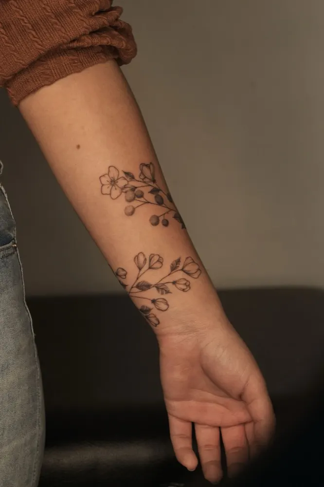
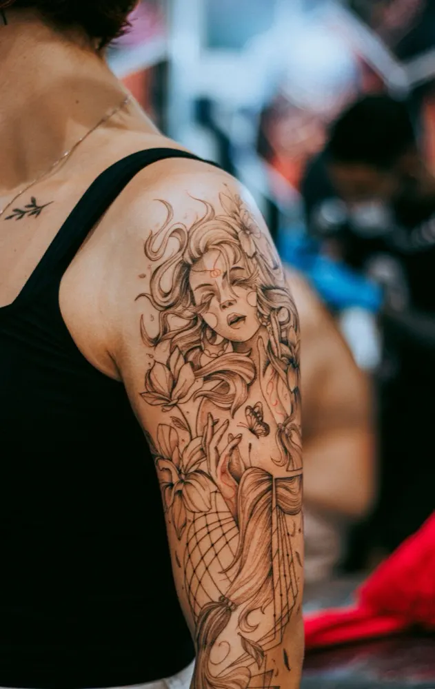
Tattoo artists live on Instagram - a grid that compresses their work, buries their booking rules and belongs to someone else. This concept project is what I think an artist's own site should be instead: a dark, quiet gallery that moves like ink in water, an enquiry form that asks the right questions, and a bilingual CMS the artist runs without ever calling me. Explore the live demo ↗ (opens in a new tab)
tattoo-demo.aleksandrahola.ch
TATTOO ARTISTPermanent art inspired by nature and personal historyBlack & grey~Fine line~FloralGet in touchView all work →
Live, not a recordingThe real hero shader, running in your browser - move your cursor across it. Beside it, the whole page on a phone.The real hero shader, running in your browser - drag a finger across it.Your device asks for reduced motion, so the field is shown as a still frame - exactly as the live site does.
The challenge
From a borrowed grid to a gallery of their own.
A tattoo artist is a brand, yet most of them rent their shop window from a social network: the photos are compressed, the booking policy is three taps away, and an algorithm decides who sees what. The usual way out - a custom website - often trades one dependency for another, with the artist waiting on a developer for every new piece. So the brief I set myself had two halves: build a gallery striking enough to be worth leaving the grid for, and hand it over so completely that the artist runs it alone - content, SEO, guest spots and all.
What I made
A gallery, a front desk and a back office.
01
Art direction
A dark, high-contrast interface that steps back, so the tattoos are the brightest thing on every screen.
02
A live ripple field
A hand-written WebGL2 shader behind the headline: fine engraved lines, bent by a real wave simulation that follows the cursor or a finger.
03
A 3D depth gallery
Built with three.js - scrolling flies the camera through the work, and each piece brings its own background colours, taken from the photo.
04
A pre-qualifying enquiry form
Style, placement, size and budget asked up front - and every piece has an “Enquire about a piece like this” button that brings its reference along.
05
Natively bilingual
English and Spanish with translated URLs, hreflang and a sitemap for both - ready for local clients and international guest spots.
06
A CMS the artist can't break
A custom-configured Sveltia CMS with a built-in handbook: pieces, guest spots, texts, SEO and colours, all editable without a developer.
The centrepiece
Scroll, and you're inside the gallery.
The featured work isn't laid out on a page - you move through it. Scrolling drives a camera through a three.js scene where every piece hangs on its own plane in depth. One at a time, each tattoo comes forward to full size while the next waits in the haze behind it, so the visitor looks at a single piece with nothing else competing for attention. It's the closest a screen gets to walking slowly past a wall of framed work.
The atmosphere moves with it. Every piece brings its own background colours, and the scene's fog is tinted to match, so the room seems to change light as you arrive at each tattoo. Each piece breathes very slightly and tilts towards the cursor, and the background responds to how fast you scroll. None of it is hand-tuned per photo: the artist uploads a picture in the CMS, and the gallery takes care of the rest.
tattoo-demo.aleksandrahola.ch
Colours taken from each photo
At build time a script reads every photo and derives a ground and two glows, kept in a quiet band of warm greys so the tattoo stays the brightest thing on screen.
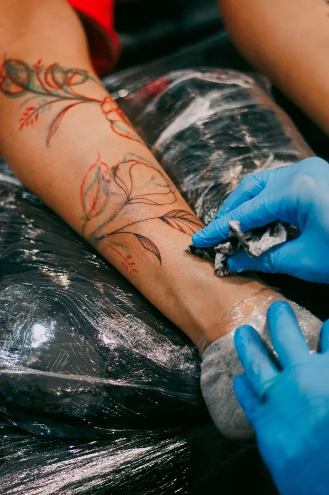
Red floral lineworkGround: #31302e Glow 1: #4c4a46 Glow 2: #595c55
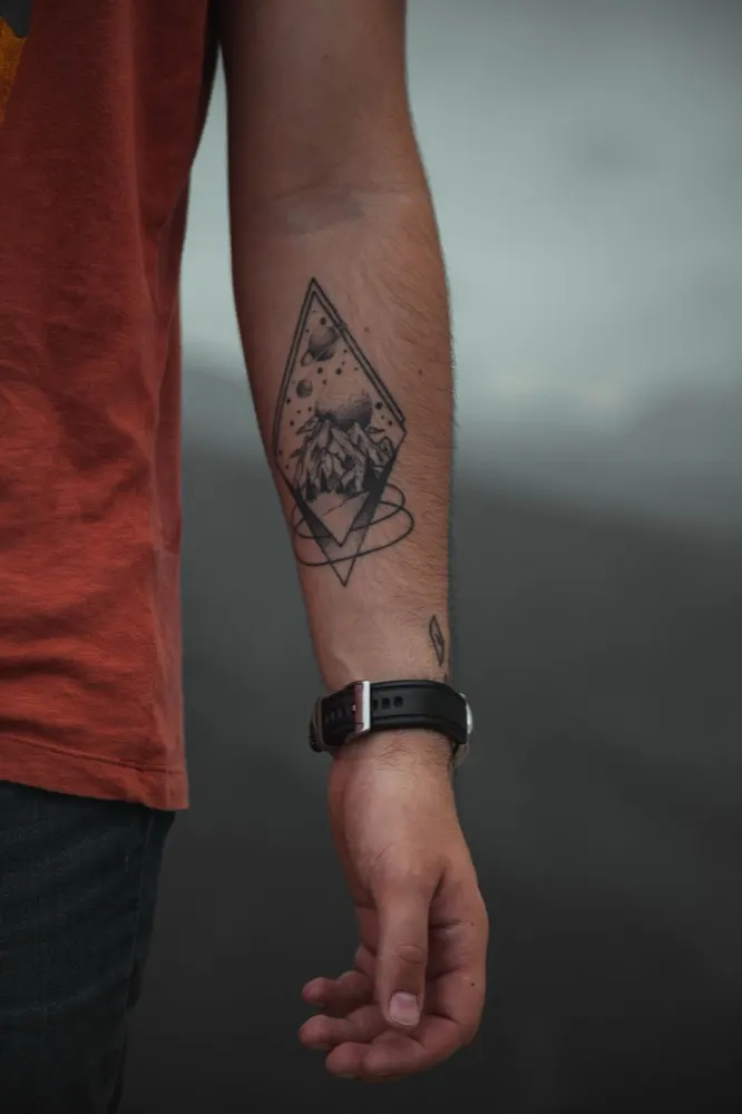
Mountain in a diamondGround: #2a2827 Glow 1: #454140 Glow 2: #54554e
Tattoo photos: Pexels. The palettes are the exact values the demo generated for them.
The approach
Designing for immersion
Everything on the front end answers one question: does it make the artwork look better?
01
A surface that reacts
Behind the headline sits a field of fine, engraved-looking lines. They drift slowly on their own, and a real 2D wave simulation bends them wherever the cursor or a finger moves - a trailing wake, ripples that meet and interfere, like a hand through water. Its brightness was measured, not judged by eye, so the pattern reads as texture and never pulls focus from the name.
02
A gallery you walk through
On the home page the work isn't a grid. Scrolling moves a camera through the pieces one by one, and the background shifts to each photo's own colours as you arrive. The full archive has its own page, filtered by style.
03
Pacing, not effects
Sections slide up over one another as you scroll, and the moving edge is tuned to travel slightly slower than your finger, so every transition feels calm rather than pushy. Lenis smooths the scroll underneath.
04
Built for travel
Artists work between cities, so the site is natively English and Spanish, and guest spots have a page of their own - upcoming and past dates, and whether books are open - that the artist updates in minutes.
Under the hood
Built light, built to last
Heavy visuals usually mean a slow site. Here they're engineered to cost almost nothing until they're needed.
01
Raw WebGL where it counts
The ripple is a few kilobytes of hand-written WebGL2, no library, so it can load above the fold. It pauses when you scroll away or switch tabs, becomes a still frame for visitors who prefer reduced motion, and falls back to a matching gradient if WebGL isn't available. three.js is kept for the gallery, where a real 3D scene earns it.
02
Content first, for people and crawlers
Beneath the 3D gallery is a real image grid in the HTML, so search engines, screen readers and visitors without WebGL still get every piece. Textures load a few pieces ahead of the camera, and phones render at a lower pixel ratio to save battery.
03
An enquiry form that pre-qualifies
Name, email, style and the idea are required; placement, size and budget are asked right alongside, so the first reply can be a real answer rather than a list of questions.
04
SEO the artist owns
Translated URLs, hreflang, canonical tags and a bilingual sitemap on every page. Structured data describes the studio as a TattooParlor - address, opening hours, location - and every upcoming guest spot as an Event. Titles and descriptions are editable per page and language in the CMS; empty one and the page falls back to its own wording instead of a blank tag.
05
A CMS with guardrails
Sveltia CMS runs on the artist's GitHub account and Netlify's login - no server and no monthly CMS fee. A 13-topic handbook is the first thing they see after signing in. Every editable file is validated at build time, so clearing a field can't take the site down, and the two colours they may change are adjusted automatically to stay readable.
Built to adapt
Change it once, the whole site follows.
The tattoo styles aren't typed into pages - they're a list in the CMS, with a name, an order and a search phrase for each. Add, rename or reorder a style there, and every place that depends on it updates on the next build: the line under the artist's name, the filters on the work page, the style dropdown in the enquiry form, each piece's page title, and the structured data that tells search engines what the studio does.
CMS · Tattoo styles
⋮⋮Black & greyblack and grey tattoo
⋮⋮Fine linefine line tattoo
⋮⋮Floralfloral tattoo
⋮⋮Dotworkdotwork tattoo
HeroBlack & grey~Fine line~Floral~Dotwork
Work filtersAllBlack & greyFine lineFloralDotworkIts filter appears with the first Dotwork piece - a filter that leads to an empty page is never shown.
Enquiry formChoose a style▾Black & greyFine lineFloralDotwork
Structured data"knowsAbout": ["black and grey tattoo", "fine line tattoo", "floral tattoo", "dotwork tattoo"]
From a piece to an enquiry
Every piece has an “Enquire about a piece like this” button. It opens the contact form with that piece already attached as a reference - visible, linked, and removable if the client changes their mind - so the artist knows exactly what the enquiry is about.
Botanical wrapFloralEnquire about a piece like this
→
Enquiring aboutBotanical wrap×Name *Style *FloralTell me about your idea *
Results
100
Lighthouse performance, desktop and mobile
0.4 s
Largest Contentful Paint, desktop
1.2 s
Largest Contentful Paint, mobile
0
Cumulative Layout Shift
Measured with Google Lighthouse on the live demo (opens in a new tab), desktop and mobile. Accessibility and Best Practices scored 100 on both.
The concept
This is a technical and visual sandbox. It shows what happens when you step away from page builders and rented platforms: a digital space as bespoke as the art it holds - which the artist still runs entirely on their own.
Demo website · Concept project · Photos: Pexels. The artist, contact details and studio are placeholders.
Swap tattoo styles for treatments, menu sections or product lines, and the same pattern fits almost any business: one list in the CMS that drives navigation, filters, forms and search data - and enquiries that arrive already knowing what they're about.
Like what you see?
Ready for a website that matches your craft?
Tell me about your work, your audience and where you want to be seen - and let's build a portfolio that stands entirely on its own.